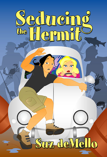
Behind the Cover: Seducing the Hermit
Seducing the Hermit was published back in 2007. 
The author is Suz deMello, with whom I’ve worked before, and bless her heart—she specifically requests my cartoon covers, AND she is one of the very few whose books actually justify the illustration style.
The last time I worked with Suz was for the cover The Wilder Brother, and we went through so many drafts doing that cover that I decided to skip all the potential communication problems and read the manuscript for myself. I normally don’t do this as I often have too much to do and too little time, and I don’t like to read a lot of what’s out there, but it’s different with Suz. I really liked The Wilder Brother, and it turns out, I really liked Seducing the Hermit, too. The manuscript was clean and tight, even before it went into editing, and reading it was actually more a fun break than research work for a cover. Reading Suz is never a chore.
The important thing? I had the entire story in my head now, along with all the character descriptions. It was time to work.
I imagined the scene I wanted to illustrate, which was the funnier one of two Suz suggested and which happens very early in the book. Simply put, the California blonde heroine loses control as she drives her overpacked VW bug off a ferry, onto an Alaskan fishing pier, and into the hunky Asian hero and his truck.
The first thing I did was search for references for my sketches—for guys falling back, kicking, or leaping and for Volkswagen bugs. These were the references I used:

Next came the sketch itself, which looked like this:
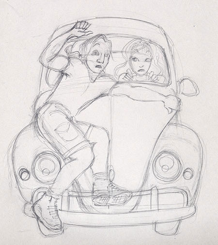
I know it’s not quite how the hero was described holding onto the car, but I wanted him facing forward, toward my “camera” so to speak—that is, if he was holding onto the wiper or the window, he’d have to be facing the heroine, not the viewer, therefore showing us the back of his head. We couldn’t have that, so I took some artistic license, and Suz was OK with it.
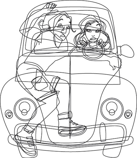
After getting her approval to proceed, I imported my sketch into Adobe Illustrator and traced the lines around each significant shape, creating a vector illustration, which looks like this in plain black strokes and no color:
This is what it looked like after I added color:
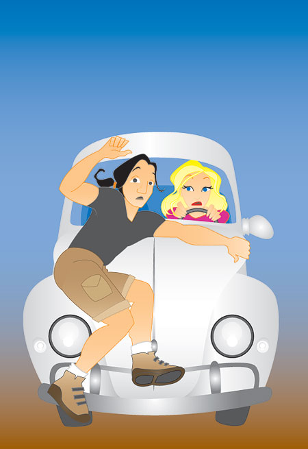
It’s the same version I posted on my blog as a work in progress and the second draft I sent Suz, who had some minor changes. She requested a more chaotic background to better show the pier setting, suggested the heroine look a little more horror-stricken, and pointed out that the hero needed to be at least a shade darker than the heroine.
At first, I wasn’t sure about adding the background because
- I really didn’t want to detract from the focus of the graphic and
- I really didn’t want to do all that extra work, but after a while, the idea grew on me.
Rather than do all the extra work myself, though, I decided to grab some of the background elements from my hand-me-down collection of clip art CDs. I found some simple people and fish shapes, as well as a barrel and some gear. I kept them all simple, with colors close to the sky or the pier, so that it was absolutely clear they were part of the background and not the subject. I also added a bouncing pebble for movement and puddles for feel, and I packed the VW bug with random household stuff, like a lamp or a microwave oven.
And of course, I changed the heroine’s expression, and I made the hero darker. Those changes were easy. Here is how the final art came out:
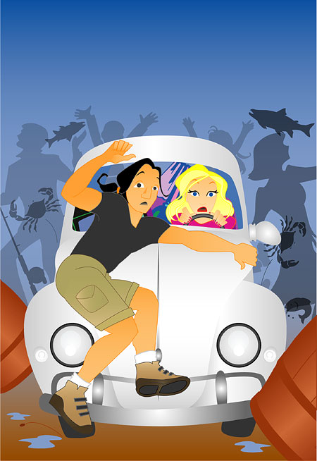
Suz gave her approval, so I proceeded with the cover text. I chose a font called Spumoni because the name just fits. The dessert of the same name is whimsical, sweet, and fun to eat, so I could think of none better to use with Suz’s book. I colored it bright yellow, like the heroine’s hair, and I gave it a stroke and a very sharp and heavy black drop shadow to match but stand out from the clean lines of the illustration.
And voila, the final cover:

…probably the most fun I’ve had creating a cartoon cover.
[NB: I originally wrote this for a book reviewer’s blog back in 2007, but the site has closed down since then, so I’m adding it here for posterity.]
Share this post: