Latest Work, 2008 Week 7
I like almost all of the covers I did in this batch, so I don’t really have any favorites, though I do like the Danny Lee series of covers I’ve done. Queen of the Burning Fields is the third in the series, and I’m curious to see where the author will take it. Maybe one day I’ll get around to reading the books. My TBR pile is overwhelming enough as it is; what’s one more trilogy?


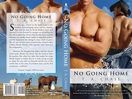
Original cover (front only) by cover artist J. Savoy. I simply took the basic elements from the original and created a full cover flat.

Slightly different from my original front-only e-book version of the cover … but much better, I think.
12 thoughts on “Latest Work, 2008 Week 7”
I really like Dead Again. I’m going through one of those ‘moments’ where it’s really ‘hard’ to pull together the stock for a cover. Do you have covers like that? Ones that just don’t want to come together. Ones that you are glad to see the back of once you finally throw something together in desperation?
Sometimes I feel limited by the ‘buff bodies’ rule. Then there are the ‘gay’ covers. Trying to find good stock that works together whilst being aware of the photographer and model’s likes and dislikes. I guess it could be quite disconcerting finding your face on the cover of a gay erotic romance book LOL! Especially if one tended to lean towards being homophobic.
Ah the trials of a cover artist, eh? 😉
Yeah, I think Dead Again is one of J. Savoy’s best work — I remember gasping the first time I saw it. The previous drafts/concepts she did were nowhere close, but that last one she did was perfect. Bang on. 🙂
As for covers that don’t seem to pull together, whew! Yes, I have had many of those. Sometimes, just for the hell of it, I’ll do something completely different just to get me out of the rut. If I’m lucky, the author will actually like it.
On the gay romances, I finally had to go out of my way and invest in a bunch of stock photos labeled as such, so the models would have absolutely no objection. It’s more money than I would normally spend on photos, but after all the frustration working in that genre I finally decided it was worth it.
Good stuff. It’s amazing how easy it is to do great covers…once they are all done…
I love the Mara Lee covers. I always notice them.
Those Danny Lee book covers are always amazing. If I wasn’t shifter’d out, I’d buy the books just from them.
April, your full covers are breathtaking. You do amazing work. Thank you for posting these.
Thanks, all! 🙂
Hmmm … so with the gay photo’s, are they nice good looking men with buff bodies? Because I’ve tried using the run-of-the-mill images available and have often gotten ‘he’s a bit scrawny’ or ‘he’s not very attractive’ LOL!
The CD collections that I’ve seen don’t seem to show all the images on the CD so I get a bit hesitant at spending that kind of money if I can’t see what I’m getting.
Can you point me in the direction of a good collection?
Thanks for your help 😀
Lyn, I assume you’re browsing the CD collections in print catalogs, as that’s where I too see a partial display of the collections themselves. If you go to the online version of those catalogs, they usually show all the images included in the CD.
As for the direction of a good collection, well … I can direct you to the mother lode of links. 🙂
http://www.bluevertigo.com.ar/bluevertigo.htm
THank you so much for the link April, however, it doesn’t seem to be working. Is it just me?
It should be fine now, I think.
Yep, got it 😀 Thanks so much.
Comments are closed.