The Wilder Cover
I don’t read chick lit, but I’ve always liked the illustration style on a lot of chick lit covers. Considering I’m into cartooning, it’s a very doable style for me, but I never really get many chances to do anything like it for work.
With Suz deMello’s The Wilder Brother, I got my third shot at doing a cartoon cover. My first was Charming the Snake, and my second was Whose Bride Is She Anyway?, where I used my own hand and arm as the model for the sketch.
The scene that Suz wanted illustrated takes place in a glass elevator. The heroine and the hero have done the hanky panky, and now the heroine is freaking out, trying desperately to leave. She manages to get the doors open while they’re in between floors, and rather than stay a minute longer, she attempts to scramble out as best she can in her dressy attire.
So I made a couple of preliminary sketches, hoping to capture the mood and wondering at what angle or perspective to present the scene. I realize then that I don’t actually know what the characters are wearing or how long their hair is, but I doodle on anyway, hoping the author will steer me in the right direction.
This is the first draft I sent to the author:
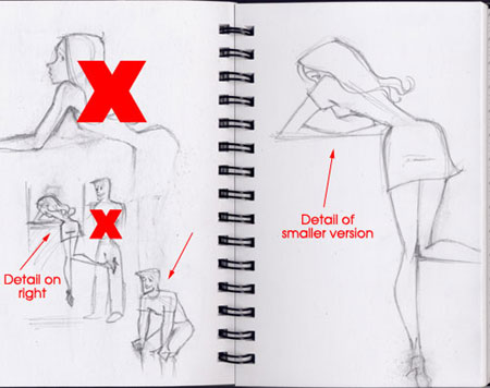
So I wouldn’t confuse her, I placed X’s over the sketches I didn’t plan on using for the next draft, and I placed arrows pointing towards the sketches I wanted to further develop.
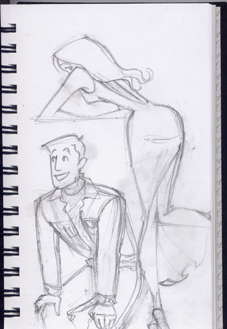
I asked questions about the clothing, and she told me that the heroine was actually in a longer dress—a slinky knit dress. The hero was in a cobalt blue turtleneck and sheepskin-lined denim jacket.
So I sent her this as a second draft:
That’s when I found out that the hero is supposed to have long, dark hair … except that she didn’t specify how long. I asked how long, but instead of waiting for the reply, I took a guess and drew this:
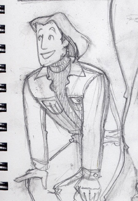
Turned out to be too long. The author reread the scene from her manuscript and told me he’s scruffy and shaggy at this point of the story, with stubble on his face. She also told me that his jaw really isn’t that square.
So I sent this:
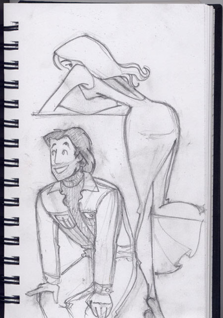
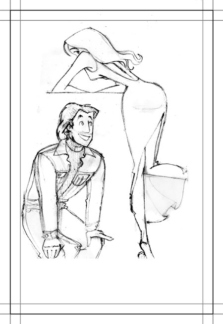
…and got the okay to move on from the sketching stage. From here, I scanned the sketch, cleaned it up in Photoshop, flipped the hero over so that he is facing the heroine, and set up a template so that the final art would end up fitting into the cover’s aspect ratio.
Here is the template, complete with bleed, trim, and margin:
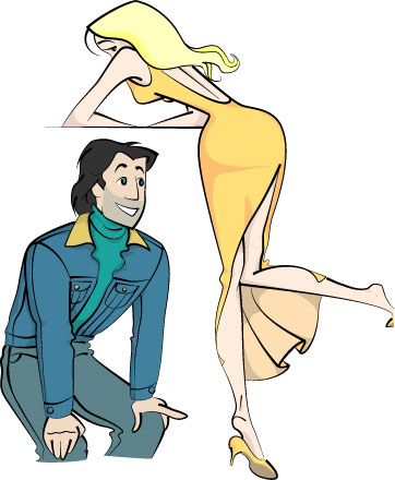
That’s when I imported the image into Illustrator and got to work on tracing and coloring my sketch. One of the first things I did during this phase is create a custom Illustrator brush so that when I traced the edges, the “strokes” would have a round end and a tapered end for a natural look. Then, after I traced the lines, I traced them again on another layer as closed shapes, for the colored “fills”.
Here’s the Illustrator work in progress—the black lines (the “strokes”) have my custom brush applied to them.
Then came the next three drafts sent to the author. Each time, I’d take a rasterized version of the Illustrator image into Photoshop and work the text into it.
These next three drafts are 5, 6, and 7:
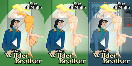
The response to Draft 5 was that the stubble looked a little too dark, which made him look filthy, and the dress a little too orange and plain when it should be cream-colored and spangly.
The response to Draft 6 was that the jacket should be a more faded blue and the turtleneck should be more cobalt rather than teal. Here, I had to do a double-take because I have no idea what the difference is. When I looked up cobalt, it seemed very close to teal, both being defined as bluish green or greenish blue … or blue-green, green-blue, glue-breen, or what have you. I wouldn’t know; I’m one of those who say “white” when I really should say “eggshell” or something. Anyway I made a note to change it.
Then we discussed whether or not it was clear to the random book browser that this illustrates a scene in an elevator, so I wrote that I would add more elevator details to the image to make it more obvious. The stubble was also still a little too dark.
The response to Draft 7, which incorporated all those changes, was that I went in the wrong direction when changing the cobalt color. In other words, I should have gone closer to blue rather than to green. Then I realized that Merriam-Webster was of no help to me at all because the author really wanted a more deep and royal blue. So that’s what I changed the color to for the final draft.
Also, the stubble still wasn’t working for her, so I figured I’d remove it entirely.
And voila, the final draft:
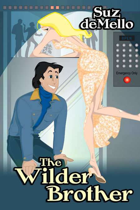
…which she liked and approved. Yay! 🙂
So went my third completely-from-scratch cartoon book cover.
Share this post:
4 thoughts on “The Wilder Cover”
Wow! That’s so cool watching the progression. Thank you for posting it. And a great cover too!
This is SO COOL April. I am seriously in awe.
I love your toons. 🙂
April., I continue to appreciate the care you took over creating this cover, and I’m flat out honored that you are doing the cover for my next LSB book, Seducng the Hermit!
Thanks,
Suz deMello
Comments are closed.